it really does look off‑puttingly bad to most people, best to delete your website/portfolio
it really does look off‑puttingly bad to most people, best to delete your website/portfolio
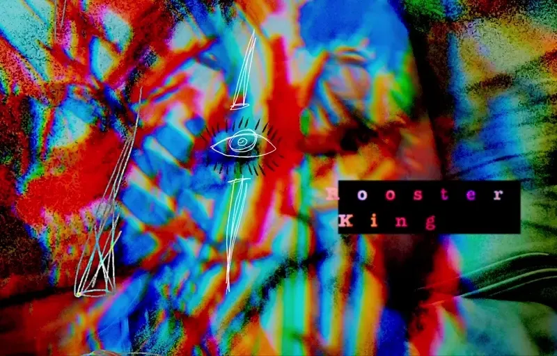
Click here to see my award winning multimedia memoir masterpiece "Rooster King"
/////////////////////////////
kamikaze dreaming: an antiresume
six masks: a memoir of my time in clown school
units of breath: how do you measure your life
iron lotus: cats in jars as a metaphor for something to do with childhoods or whatever
null call: advice for the vestigial shamans among us
four songs: meditations on maureen
generative adversarial relationships: human creative systems through the lens of our AI counterparts
the form of formats: how to play a game that doesn't exist
hey im going to the store, do you want anything?

when the end of the world comes, you know where i'll be
also i'm sorry that i'm gay
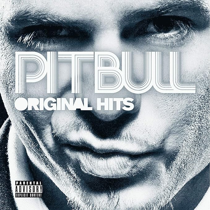
hey did you know that i made an album cover for pitbull? cause i did, yeah. he’s a big celebrity if you didn’t know that. it’s not that big of a deal but some people think it’s kindof cool. yeah ha ha that was crazy...